Like everyone else in the world, my entire life I've been surrounded by advertisements. My dad has been a successful professional graphic designer for decades, doing work for The Oak Ridge Boys, Bridgestone, and Kyzen Chemicals to name a very few. Ever since I can remember, typograpghy and creative advertisements were pretty much a part of my daily life.
I dabbled in following the family business but I seemed to have more passion for other creative things like music, stencil art and writing, but I never lost the love I had for cool eye catching logos. Since I moved to Washington, I've been taking pictures of logos and such that I think are pretty impressive. You'll see I have a love for a certain style and for some reason, I love animals on my logos... can't explain it, just do. They look regal to me, royal and important if you will. Also, I tend to gravitate toward a dark look and alcohol labels... that last one's a given I guess. And I just love the stencil aesthetic which you see a lot of in the logo's I like.
I'll continue to take pictures of logos and labels as I find them but here are the top 12 for now.
I love dark designs. I've been drinking Avery Brewing company's White Rascal for years but I must say whomever is doing their label is killer. It's sinister yet beautiful and darn it, now I want one! I rarely see cans of this stuff, but I found this at the local "Harbor Greens" market in Gig Harbor.
My picture is poor but this beautiful design is a beer label fashioned for the amazing HBO show, Game of Thrones. The Iron Throne Blonde Ale was pretty good but I couldn't help appreciating the complex and old world gold and red and black design. Hmmm, is the "Iron Throne BLONDE Ale" a spoiler alert? Go Khaleesi!
Ok, I'm from the South, so I love BBQ. I have no idea if this stuff is any good but the label is cool. It's also very stencil-esque so that speaks to me too. It's a bold design which translates that the sauce if bold as well. Well, that's what they're going for I guess.
This one's a bit simple, but I dig the 2D stencil-ish demon head... see another theme? I mean who wouldn't be excited to get a box in the mail with Diablo printed on the side? Even if it were saw blades.
I've never had Sheep Dip before but the name is a huge turnoff. How can anyone make it cool and inviting? Put an angry woodcut of a devilish sheep on your label, that's how! I'm a fan of anything that hearkens to antiquity and I can almost see running across this in an Edwardian era pub. Even though it probably isn't, the design makes me think it's old, with a recipe that's been handed down and hand crafted through the ages. Let's give the ole' Sheep Dip a try.
This is not that unusual, but I like the turkey and you just can't help noticing the shiny gold and black package. At 100 calories a bag, I've heard this stuff is amazing. Eye catching... check.
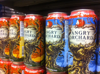
I'll admit, I used to be a hard cider hater, and I'm still a beer guy at heart but I've learned to appreciate a good hard cider and well, besides having a cool fantasy/Lord of The Rings looking design, Angry Orchard makes good stuff. The colors are impressive and pop right off the can. It's like a painting, how can you not want to try it?
How can a mouse trap be cool? Just stick an ultra cute mouse inside the V on your logo, that's how. I seriously want a shirt with their logo. I'd rock that around town like it was the latest Prada design.
I have not had this brand of cider yet but the Rhino is awesome! So is the typography in my opinion. It says it bold and dry and traditional without reading a word. Pretty cool and of course the angry stencil Rhino is awesome. Yeah, I'd rock this as a shirt too.
This is a little different for me, but it caught my eye. It's the old style that I like. Come on, it looks like a dog biscuits recipe from your crazy great great grandmother that used to hand make dog treats for strays on the farm. That has to be quality stuff right?I want to get these for Luna. (More on her soon)
I'm a sucker for labels and well, anything that has edition numbers on it. I guess it comes from my love of limited art and toys. It also doesn't hurt that it's kind of a dark design and it has an old school demon guy on it beckoning you to jump in head first.
Now this is just bad ass. The negative space armored Spartan is brilliant and it instantly relays the message that this is a strong, determined, tough company that's not afraid to get their hands dirty... or spend a little money on a great logo. Also, it says a lot about a company like a "Sewer and Drain Cleaning Equipment company" to make themselves look good... I mean who would expect such a weird company to be so forward and proud? Kudos guys! If I had any need for Sewer and Drain Cleaning equipment, you'd be the first I'd call.
So that wraps up my logos for now. I'm sure I'll make a new post semi-soon as I come across some eye massaging logos and designs.
Subscribe to:
Post Comments (Atom)


No comments:
Post a Comment